(Not) Your Average Twitter User
Discovering groups of similar Twitter users based on their profiles.
To find the user types, we applied unsupervised learning methods, concretely $K$-means and DBSCAN clustering. We assessed similarity based on the following properties:
- followers count
- friends count (i.e. how many accounts the user follows)
- followers-friends ratio
- proportion of tweets
- proportion of RT
- proportion of replies
- days since account creation
- average number of statuses per month
- average number of hashtags per post
- average number of URLs per post
- average number of mentions per post
- average number of retweets per tweet
First, all of the above features were scaled so that they fall into the range $[0,1]$. For DBSCAN, we tried to find suitable parameters (neighbourhood size and $\epsilon$) by grid search. Despite that, the algorithm often outputted a very low number of clusters and classified a large fraction of users as noise. As the result was not showing satisfactory results, we considered $K$-means as an alternative. For $K$-means we plotted plotted the distortions ( sum of square errors) for a range of $K$:
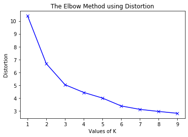
From this plot, a good number of clusters seems to be 3, however our estimated $K=6$ is also not a bad choice, so we stick with it. This clustering method resulted in uneven clusters (some are much bigger than others), but each group is well represented.
To visualize the obtained clusters, we tried linear and nonlinear methods using PCA and t-SNE, however the plots were not very useful – one could not identify the clusters within the plots. The densities of the features were a bit more informative as from these one may be able to infer which features played an important role during clustering. In particular, features where there is a lot of overlap in their distribution between clusters might not be useful for differentiating between users.
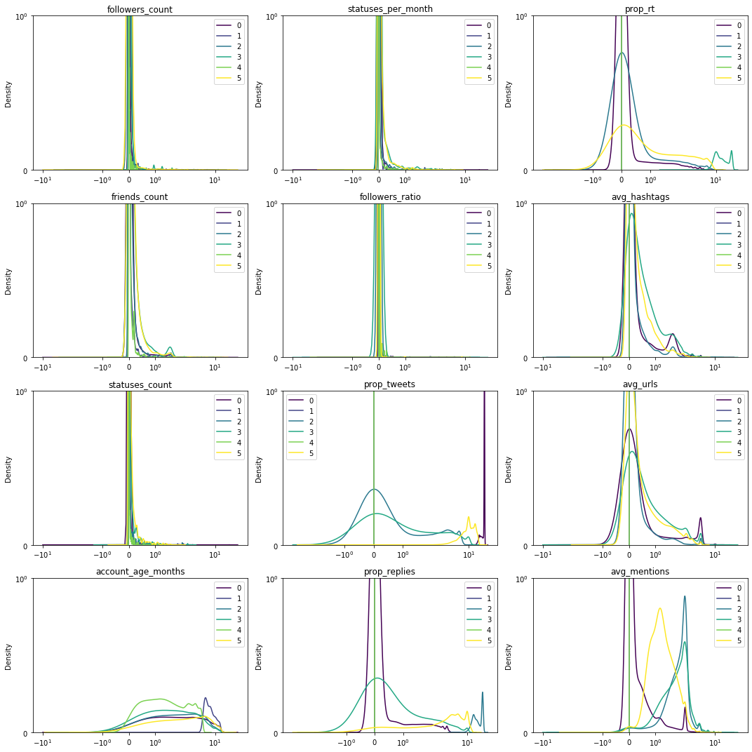
Surprisingly, some of the features that were considered as the most important ones have similar distributions for all clusters, such as number of followers or statuses per month. We will now look more closely at the remaining features, first pairwise:
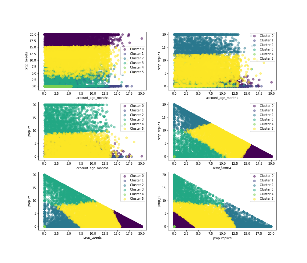
And individually:
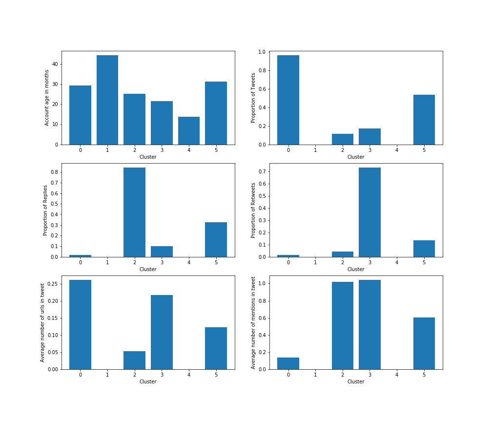
From here, we start seeing what characteristics might be linked to each cluster. We try to summarize and interpret them as follows:
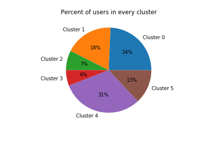
- Cluster 0 ($24\%$ of analyzed users): This type of user has the biggest characteristics on URLs in tweets and on tweets, but relatively small replies, retweets and mentions, which means – small interaction with other people. This category might be some company/program, and the amount of tweets with URLs is for advertising movie, product or company.
- Cluster 1 ($18\%$ of analyzed users): The cluster has almost no tweets, mentions or any activity. But, the account age is one of the highest. So, this is the reader. The person, who reads a lot, but does not communicate with anyone through Twitter or generate new content. It may be a person who values privacy. It could also be a completely inactive account which has not yet been erased.
- Cluster 2 ($8\%$ of analyzed users): This type of user often uses mentions and replies, which means he or she uses Twitter to communicate and engages in discussions with other users.
- Cluster 3 ($6\%$ of analyzed users): A typical user from this group only generates a small amount of contents and replies, so this users does not communicate with the others that much, but has the biggest rates of mentions and retweets. This might be a celebrity who retweets a lot about her/his new movie/music album or political activist, that retweets most important news in the sphere.
- Cluster 4 ($31\%$ of analyzed users): Having the smallest values of different features, including the account lifetime. That means that the account was created for some purposes and has not being used as a normal account. For example, a person created it for spying, or it may be a bot, which collects some statistics and information on other users. Accounts in this cluster vere were created the most recently on average.
- Cluster 5 ($13\%$ of analyzed users): This type uses all the functionalities but does not prevail on each kind of possible twitter activities which means it is regular active user. He uses all the functions of the applications, but does not follow some specific purpose such as advertising, or increasing his influence.
You can display various feature pairs to compare cluster centres here (Cluster 0, Cluster 1, Cluster 2, Cluster 3, Cluster 4, Cluster 5):
Once we had our clusters, we wanted to explore how users from each group use Twitter from the day they join. To do this, we decided to plot the some metrics (number of tweets, URLs, as well as retweets to track their popularity) that can help us understand user’s Twitter activity over time. These were averaged accross the closest 10 points to the centroids of clusters, to make:
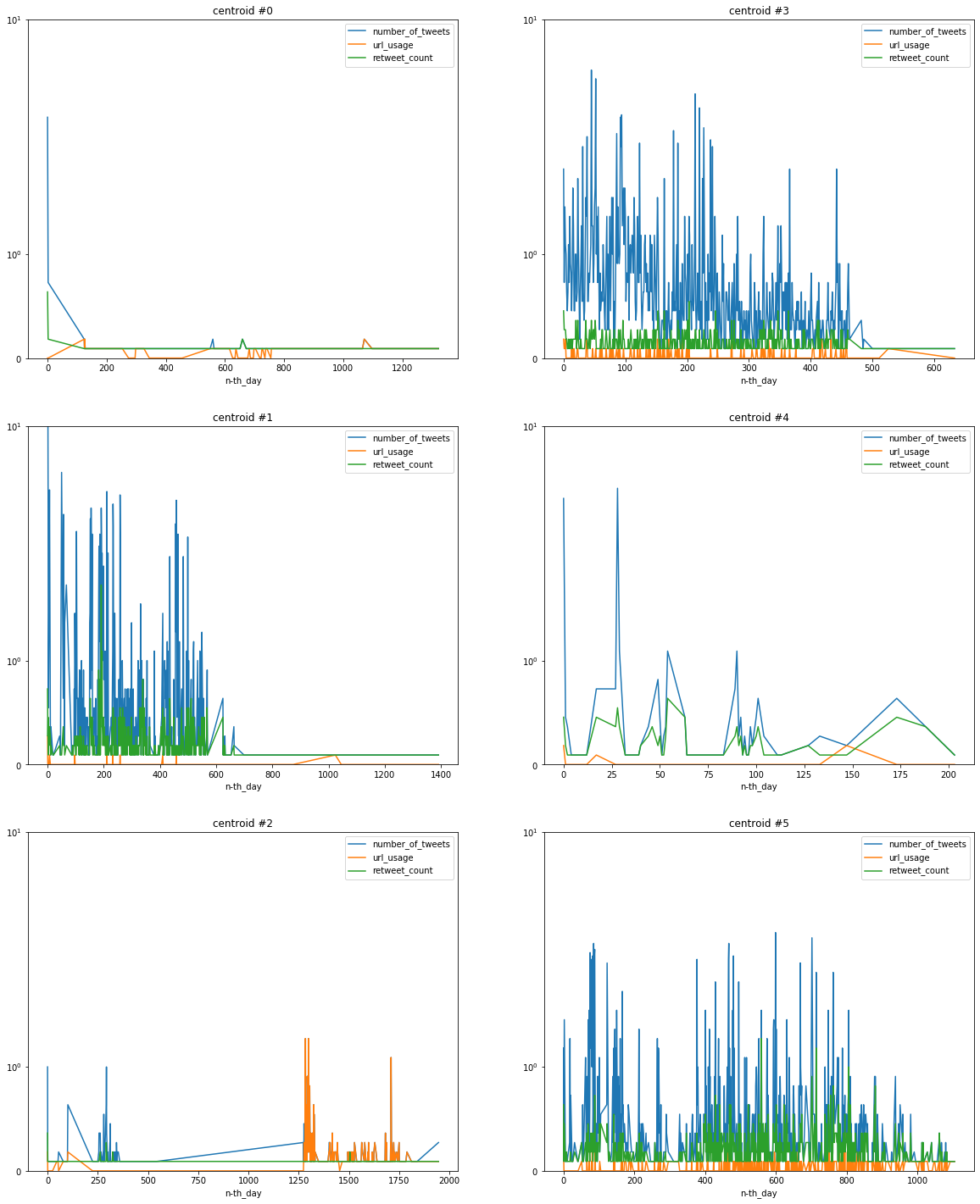
- Cluster 0: The average users seem to be active only first few months and then lose interest.
- Cluster 1: Active users for a certain period, then sudden drop in activity. Maybe they started a family?
- Cluster 2: Comparatively low activity and higher usage of URLs towards the end of the studied period. A regular user turns into a spammer?
- Cluster 3: Negative trend in tweeting activity, constant popularity.
- Cluster 4: Rare visitors, probably tweets on holidays.
- Cluster 5: Regular active users.